|
Why is it, that in the 21st century, our country's economic data has to look like a bunch of numbers and tables? Why can't there be more graphs and other data representations which are more easily understood by the general public? Based on data from the Central Bank (of Barbados) Report issued on 31st October 2017, I thought to myself “Why not try my hand at making these numbers look a little more presentable, even “pretty” maybe ?” The graphs at the end of this blog present the public debt outstanding data based on table 5 of the aforementioned report. By the way, this isn't even new stuff! Check out Singapore's Budget, I see pie charts and bar charts, do you? http://www.singaporebudget.gov.sg/data/budget_2017/download/FY2017_Analysis_of_Revenue_and_Expenditure.pdf Disclaimer: The data presented in this blog was not created by an economist or other official government representative but used merely for illustrative purposes to augment the author's position. The official report can be viewed on the Central Bank's web page at http://www.centralbank.org.bb/Portals/0/Files/CBB%20Quarterly%20Economic%20Review%20Jan-Sept%202017.pdf 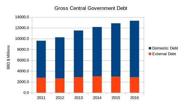 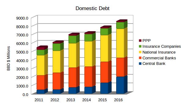 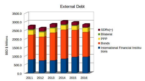 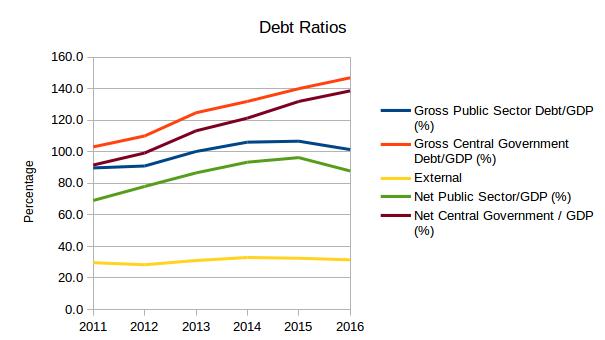
0 Comments
Leave a Reply. |
AuthorI like to think of myself as a GIS hobbyist. Its just something about maps that interest me! Archives
September 2021
Categories
|
 RSS Feed
