|
As part of the Barbados Association of Professional Engineers' Newsletter Editorial team, we reintroduced the BAPE newsletter entitled "The Engine Room - Volume 1 Issue 1". We're pleased to invite it you to view now via the following link: https://bit.ly/BAPENewsletter2022_V1_01 or visit our webpage https://bape.org/ 
0 Comments
In an attempt to add some more useful information to the shelters map, I utilized a sleek new side bar. This gives details on the two types of shelters in addition to the motivation behind the creation of the map. You can see some of the screenshots below or visit the site for the full experience. Hope you enjoy. Big thanks to the plugin creator "Norwin" over at github! Last year, March 2019, a group of us from Purpose 180 Foundation made the trip to Dominica to assist in the facilitation of a youth leaders retreat in Bataca. This is on the Eastern Coast of the island. It was a life changing weekend, as we shared with the participants about the various tools they could use to improve their presentation of the gospel to the youth in particular. Hope you enjoy the video below showing some of the events that transpired. It's been over a year since initially publishing my first map. Oh how time flies! In order to create a more finished product, I decided to add a header to the page as well as a location feature which zooms into your current location. A feature which my friend recommended upon hearing of the concept. These additions proved to add a touch of professionalism which the previous map lacked. All in all, the journey continues to be a great learning experience, one in which I see many great opportunities in the future. Over and out! KMROSS 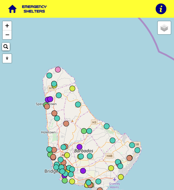 Why is it, that in the 21st century, our country's economic data has to look like a bunch of numbers and tables? Why can't there be more graphs and other data representations which are more easily understood by the general public? Based on data from the Central Bank (of Barbados) Report issued on 31st October 2017, I thought to myself “Why not try my hand at making these numbers look a little more presentable, even “pretty” maybe ?” The graphs at the end of this blog present the public debt outstanding data based on table 5 of the aforementioned report. By the way, this isn't even new stuff! Check out Singapore's Budget, I see pie charts and bar charts, do you? http://www.singaporebudget.gov.sg/data/budget_2017/download/FY2017_Analysis_of_Revenue_and_Expenditure.pdf Disclaimer: The data presented in this blog was not created by an economist or other official government representative but used merely for illustrative purposes to augment the author's position. The official report can be viewed on the Central Bank's web page at http://www.centralbank.org.bb/Portals/0/Files/CBB%20Quarterly%20Economic%20Review%20Jan-Sept%202017.pdf 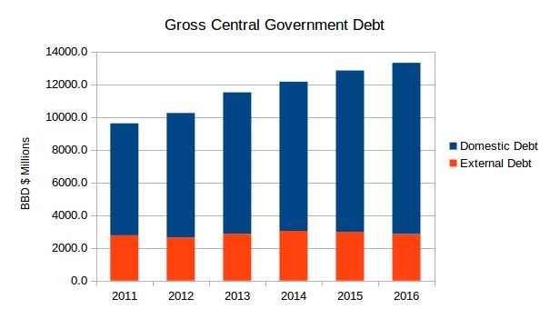 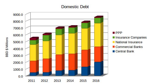 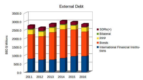 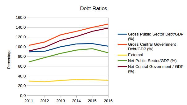 Utilising QGIS, MyMaps (Google) and with the help of github, I was able to create my first webmap. It showcases the emergency shelters in my home land, Barbados. These shelters are intended to be utilised during and after a natural disaster; namely storms. Due to the frequency and intensity of the hurricanes in the region, some of which have struck our Caribbean neighbours Dominica, Barbuda, Anguilla, St, Maarten and the BVI, it was suggested to me by a work colleague the need for maps during events like these. In doing my research, it was found that no such map was currently available for the Barbadian citizenry and as such one should be created. I hope you like my attempt to make Barbados a more disaster prepared nation. See link to follow for map: kmrg-maps.github.io/Barbados-Shelters
|
AuthorI like to think of myself as a GIS hobbyist. Its just something about maps that interest me! Archives
September 2021
Categories
|
 RSS Feed
